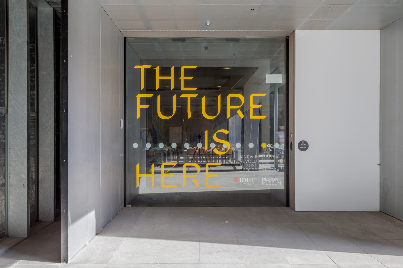
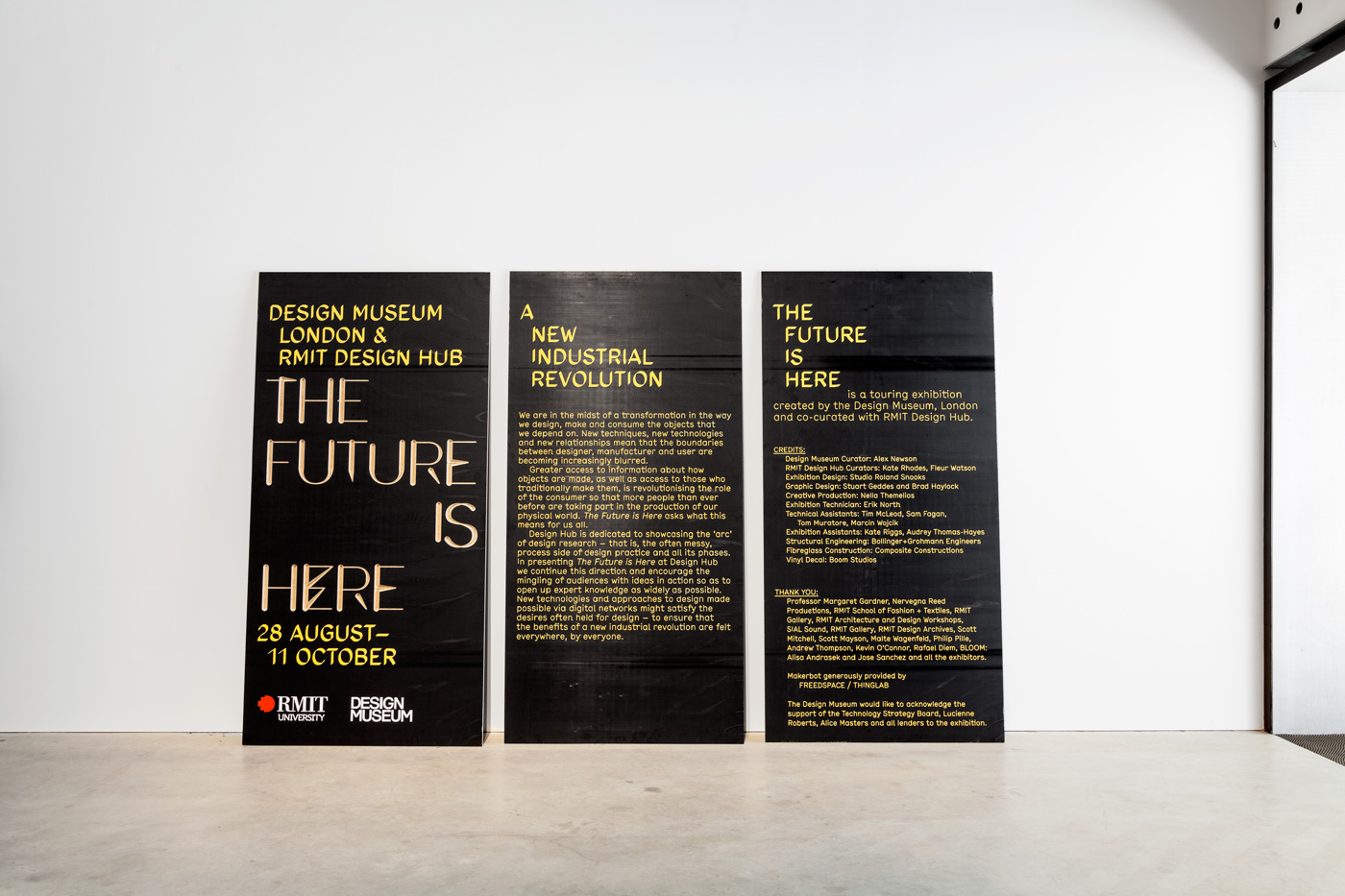
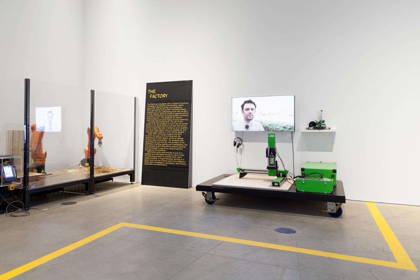
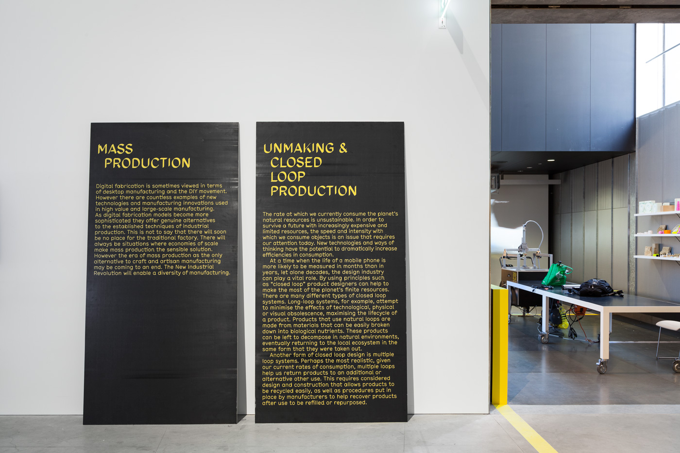
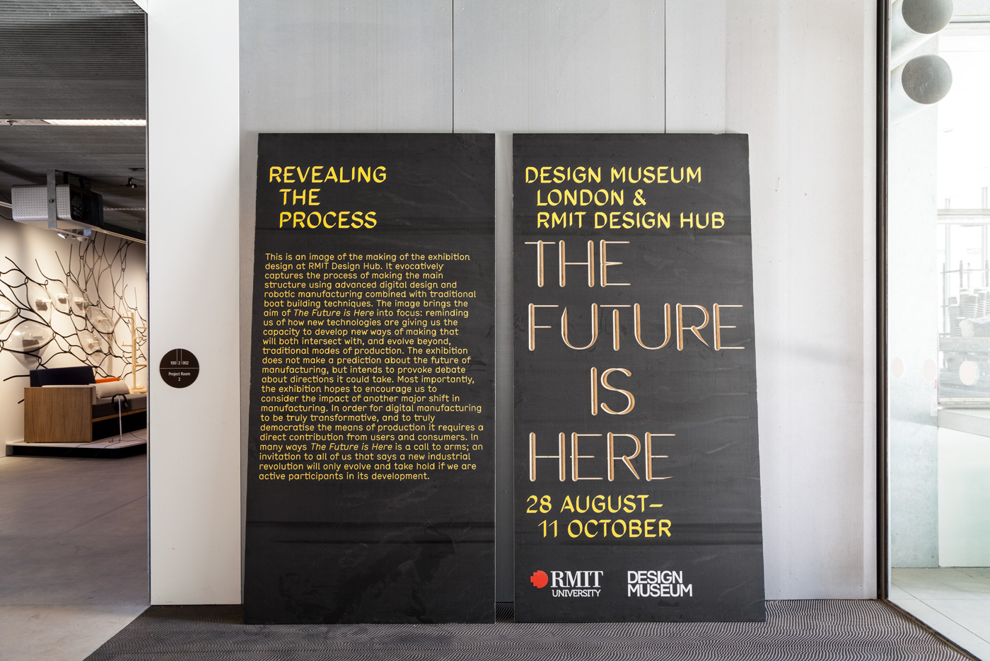
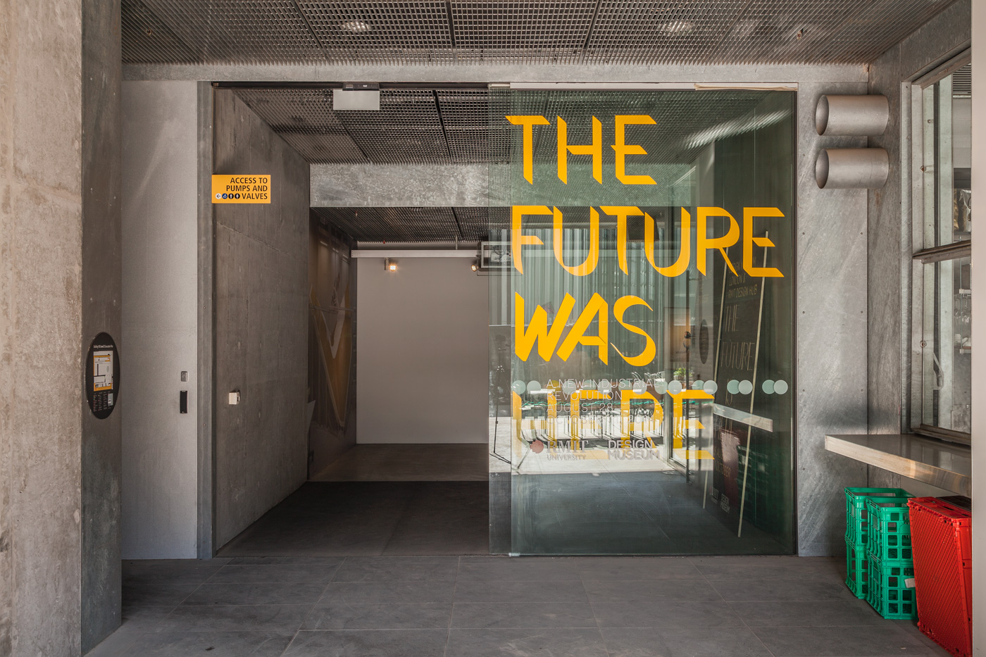
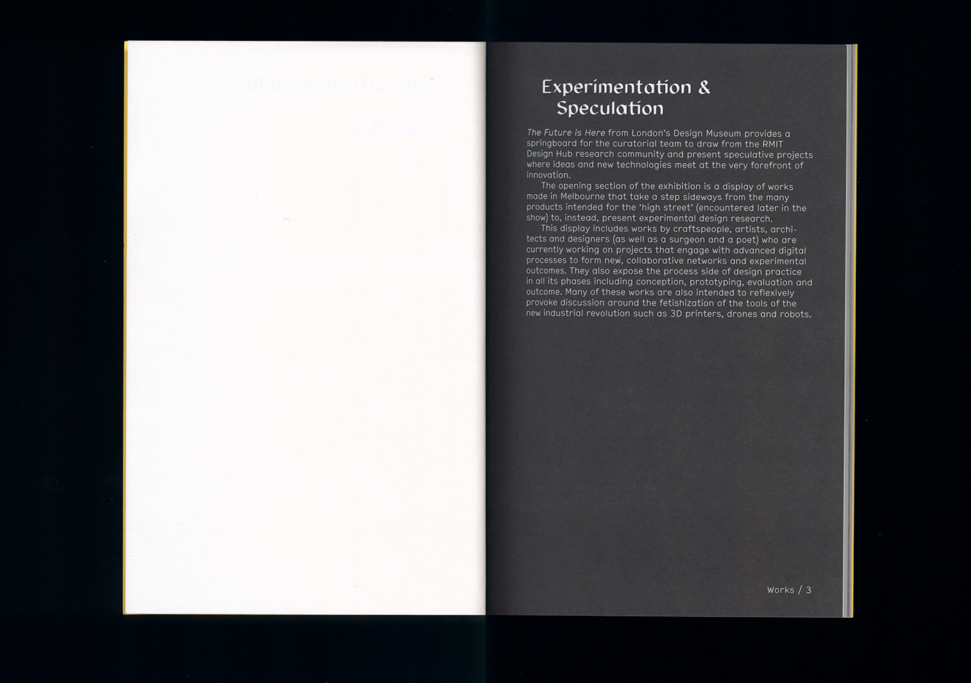
The Future is Here, an exhibition at the RMIT Design Hub, investigated the impact of new technologies within the context of a ‘third wave industrial revolution’ or a post-digital age. How do technologies like 3D printing and robotic manufacturing infiltrate our homes, workplaces and streets, and how can we take an active role in shaping what this means? The exhibition graphic design (made with Brad Haylock), explored these questions and themes. The typography and collateral material showcased the latest design and production technologies, and some advanced manufacturing techniques usually reserved for other disciplines, like architecture or industrial design.
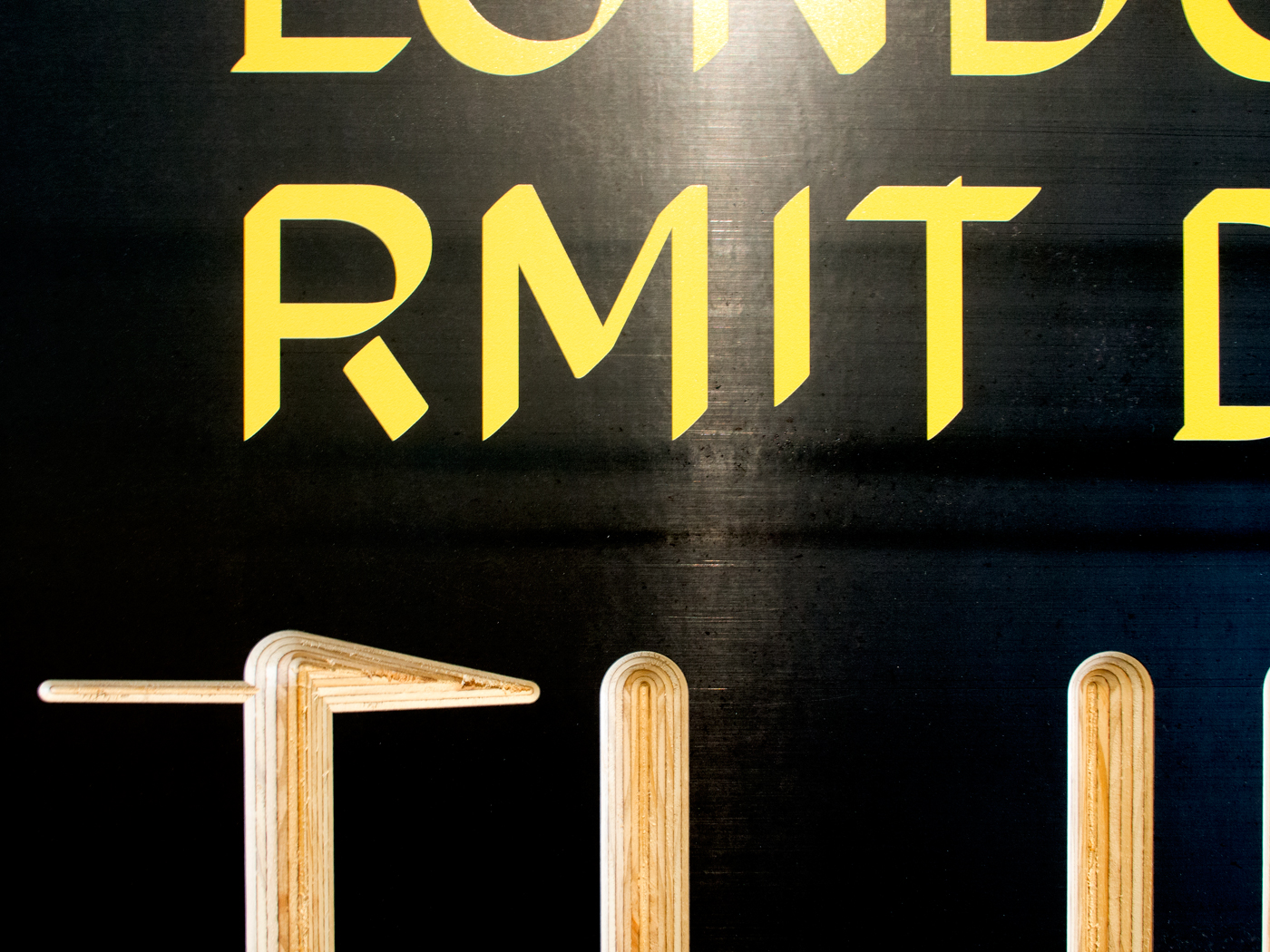
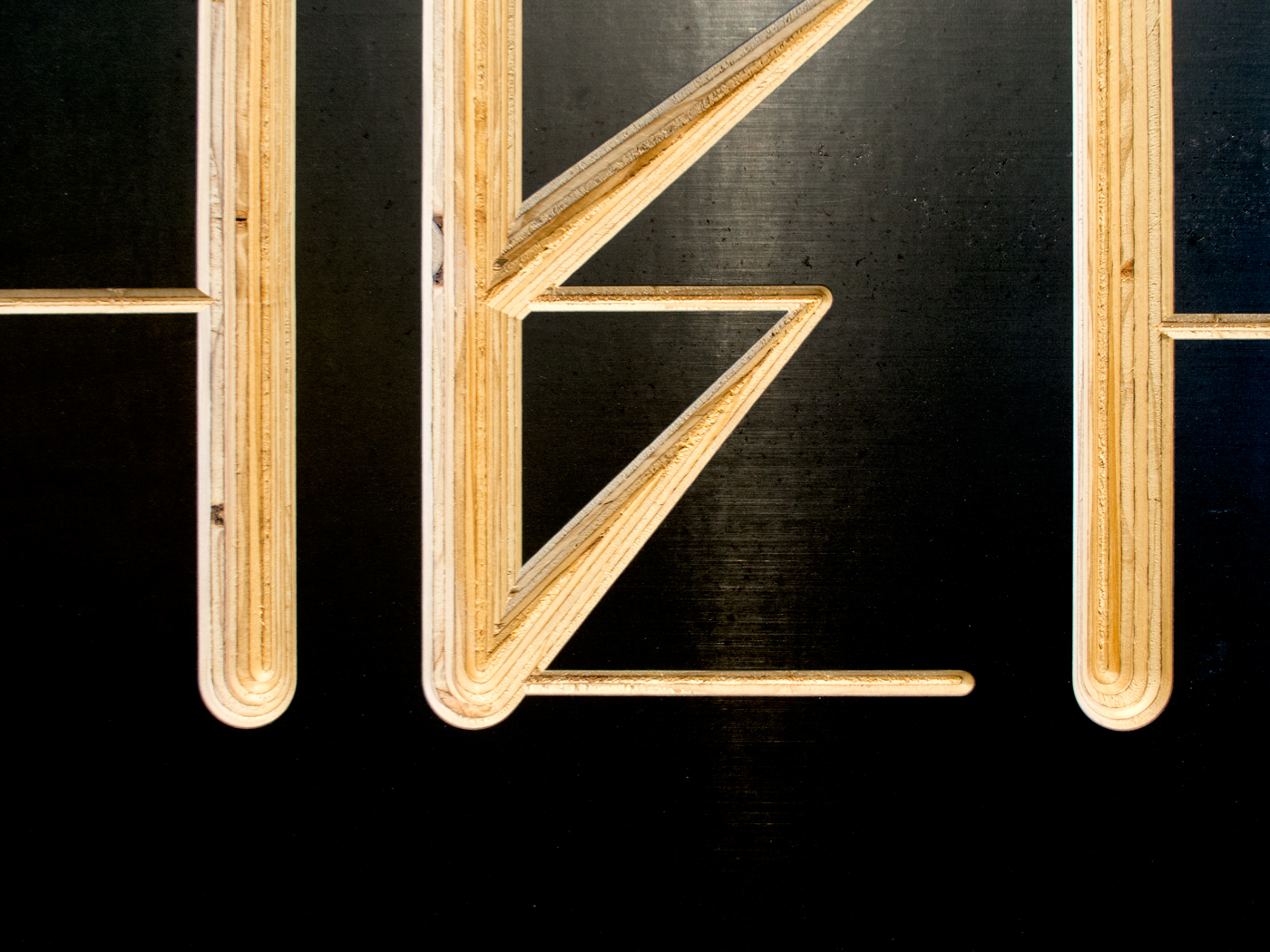
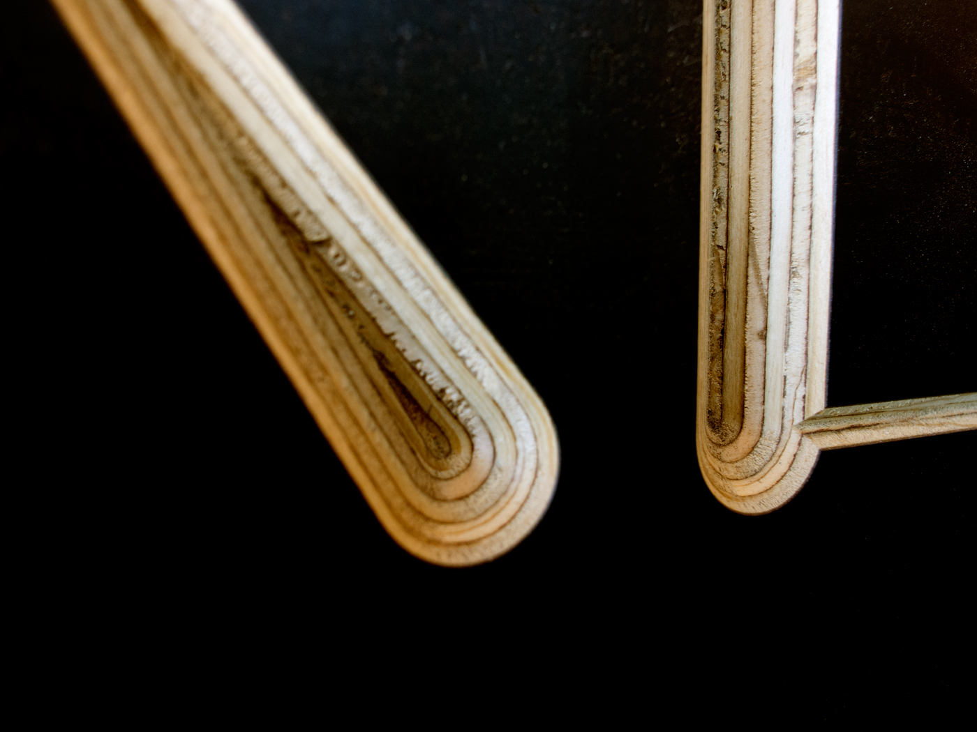
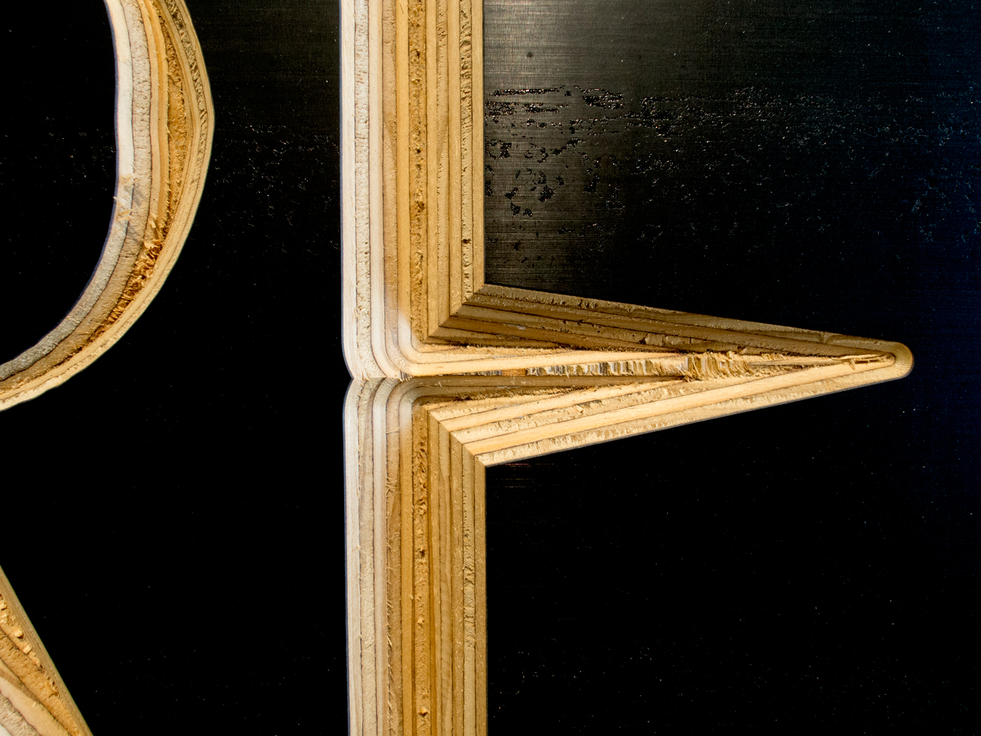
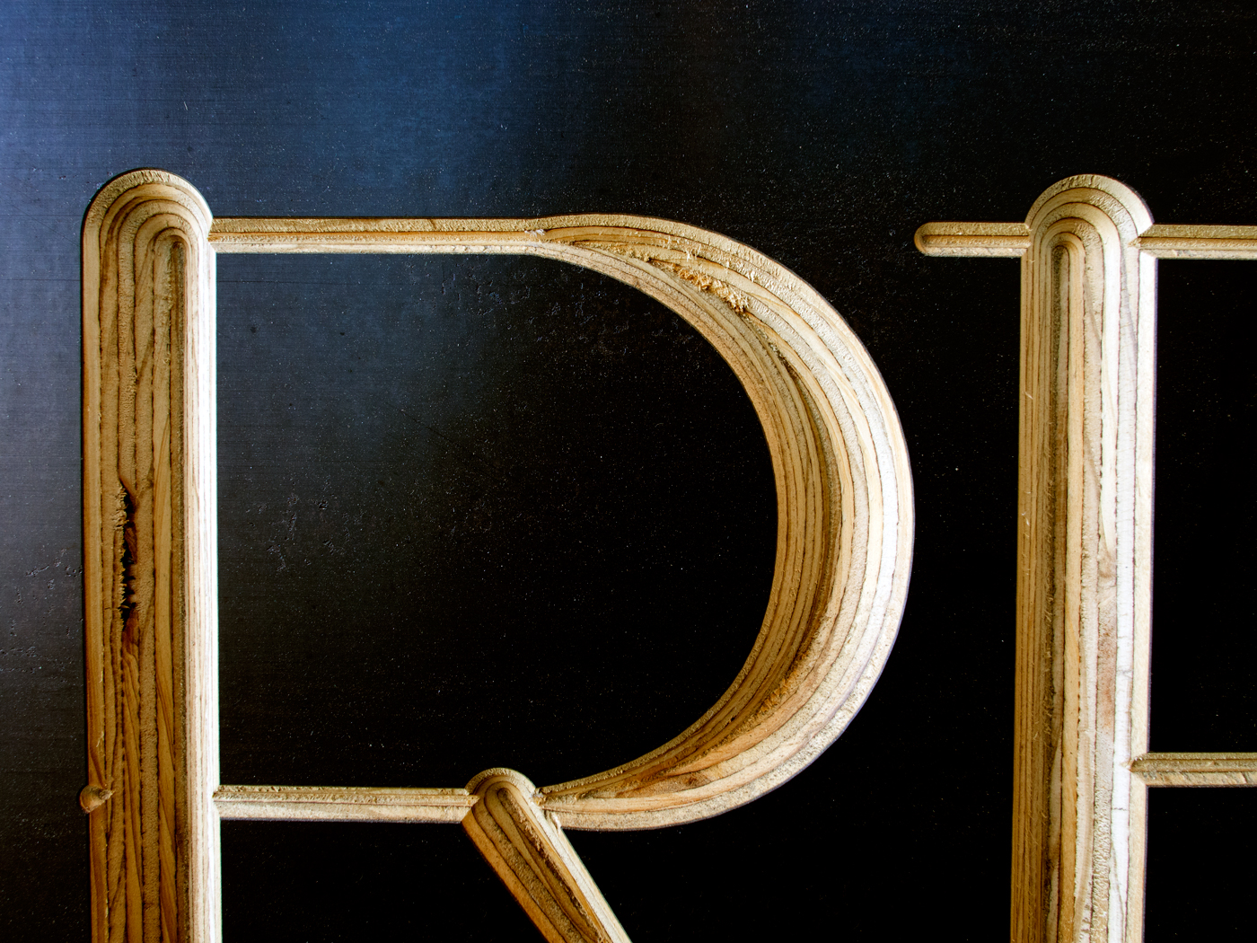
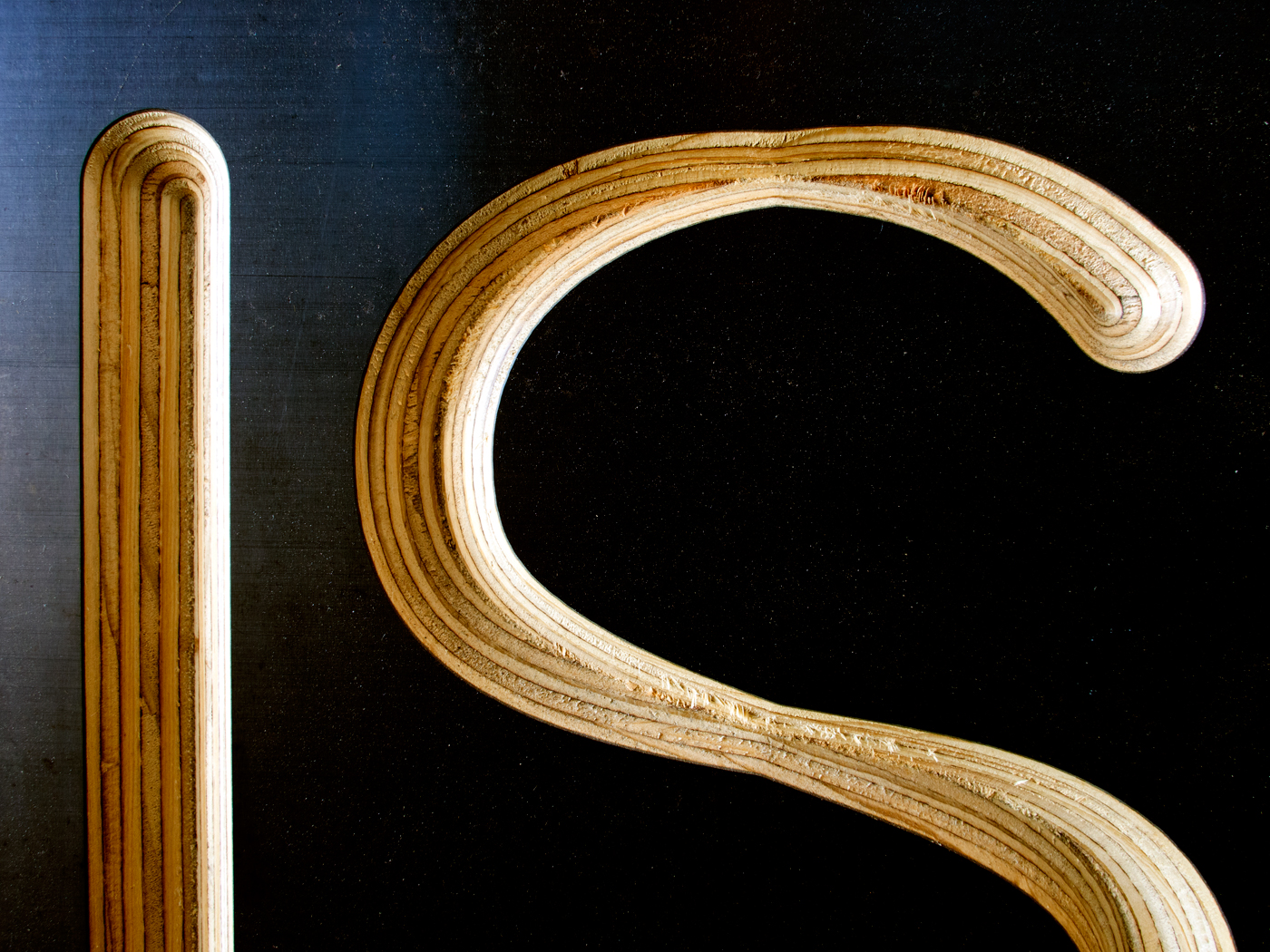
At the core of the work is a ‘skeleton’ typeface modelled on that used in the ongoing visual identity of Design Hub, originally selected by Fabio Ongarato Design. But, in a playful demonstration of the possibilities of the OpenType standard, the typeface developed for us by type designer Dan Milne features hundreds of subtle (and some not so subtle) idiosyncrasies, mimicking the imperfections of handwriting: lines are too short, so parts of letters don’t join, or they double back on themselves, and sometimes the pen doesn’t leave the page, so extra lines are scrawled while hurrying to finish drawing a letter. This ‘skeleton’ is then expressed using different pens or tools (some physical, some digital).
In the fifteenth century, Johannes Gutenberg invented movable type: individual metal letters were set together to print words on a page. Gutenberg’s letters were modelled on the handwriting of the time, but all of the inconsistencies of handwriting are erased when cast as metal type. These ideas were further explored using robots and three-axis routers as writing machines. By plotting the typography in space using architectural modelling software, and routing at different depths, we achieved something analogous to stone-carved lettering. Similarly, in adapting a machine to hold a Posca ink marker, the result echoes toilet stall graffiti, or is it café blackboard signage? Paradoxically, five and a half centuries after Gutenberg’s invention, contemporary font technologies allow us to reintroduce the idiosyncrasies of the human hand into printed and engraved characters.
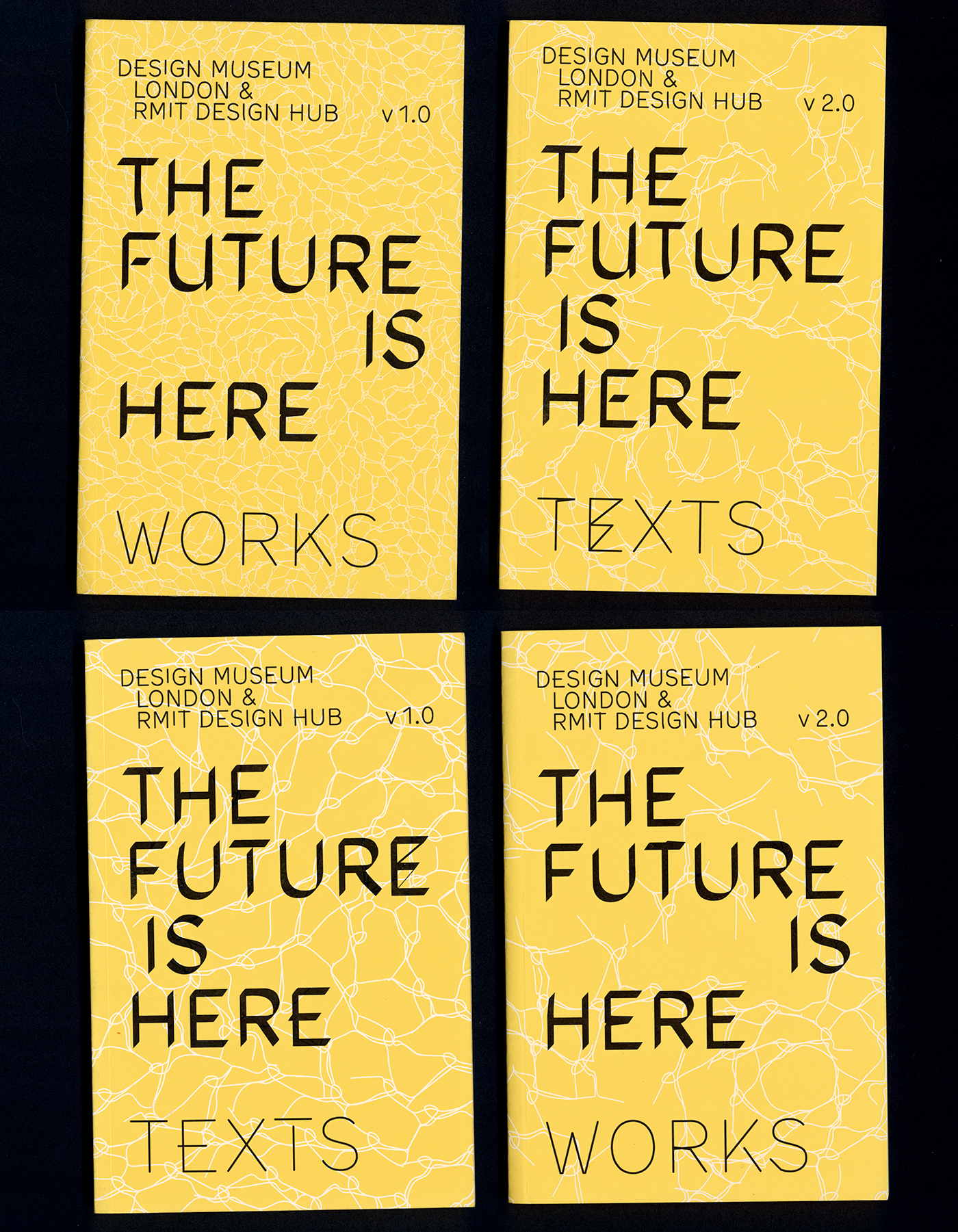
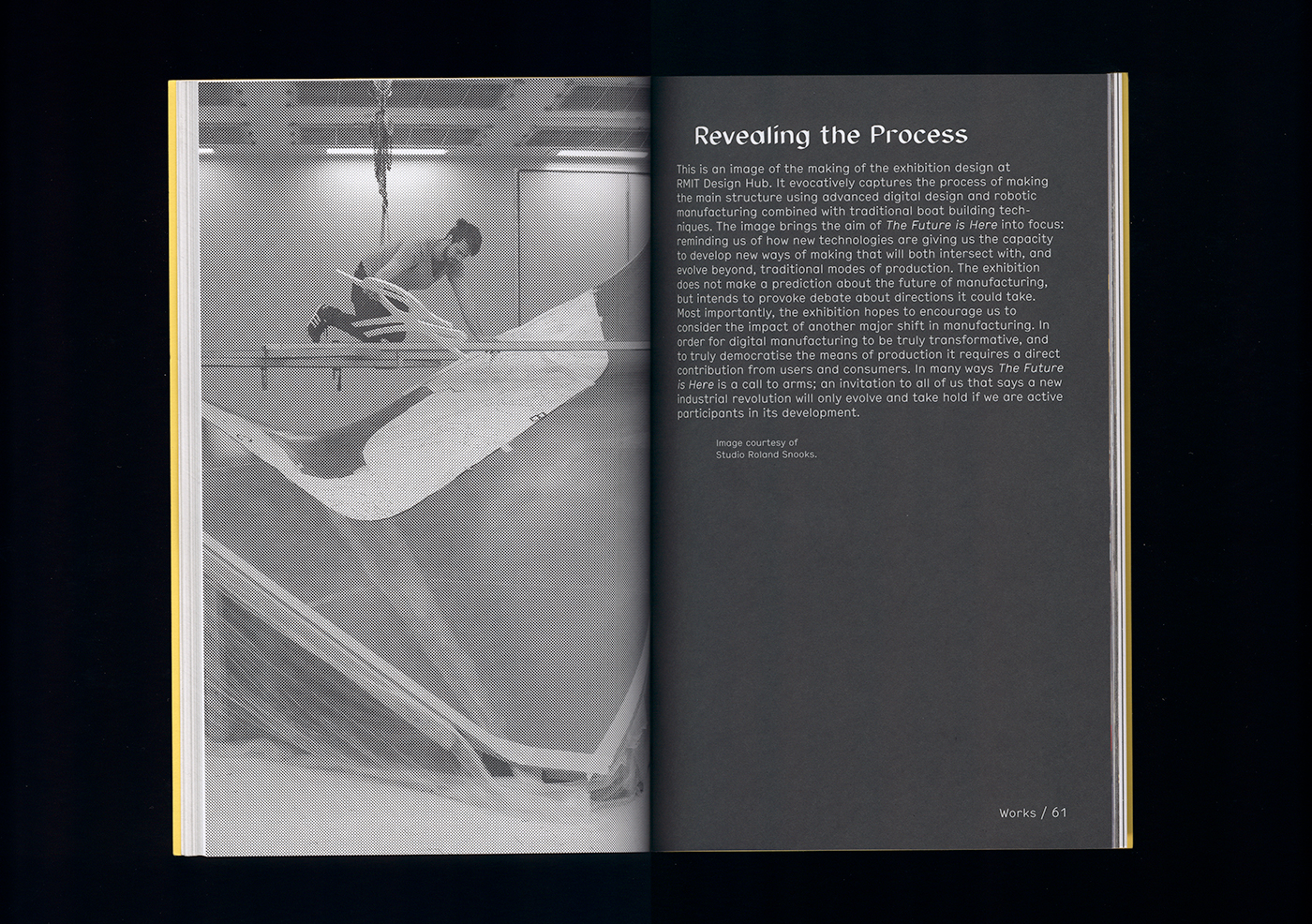
The cover of the catalogue was produced using digital offset printing—a quintessentially twenty-first century print technology allowing short-run customisation. For this book cover, the variable data isn’t an addressee’s name, but the background motif, which is the biomimetic pattern developed by Studio Roland Snooks as the ‘skeleton’ of the exhibition furniture. This ‘skeleton’ was grown step-by-step using algorithmic process, then cut and extruded robotically, and covered with fibreglass to create a surface. Evoking this process, the patterns on the cover of these books grow and shift from one copy to the next, so no two copies from the print run of 4000 are exactly alike.
Notes
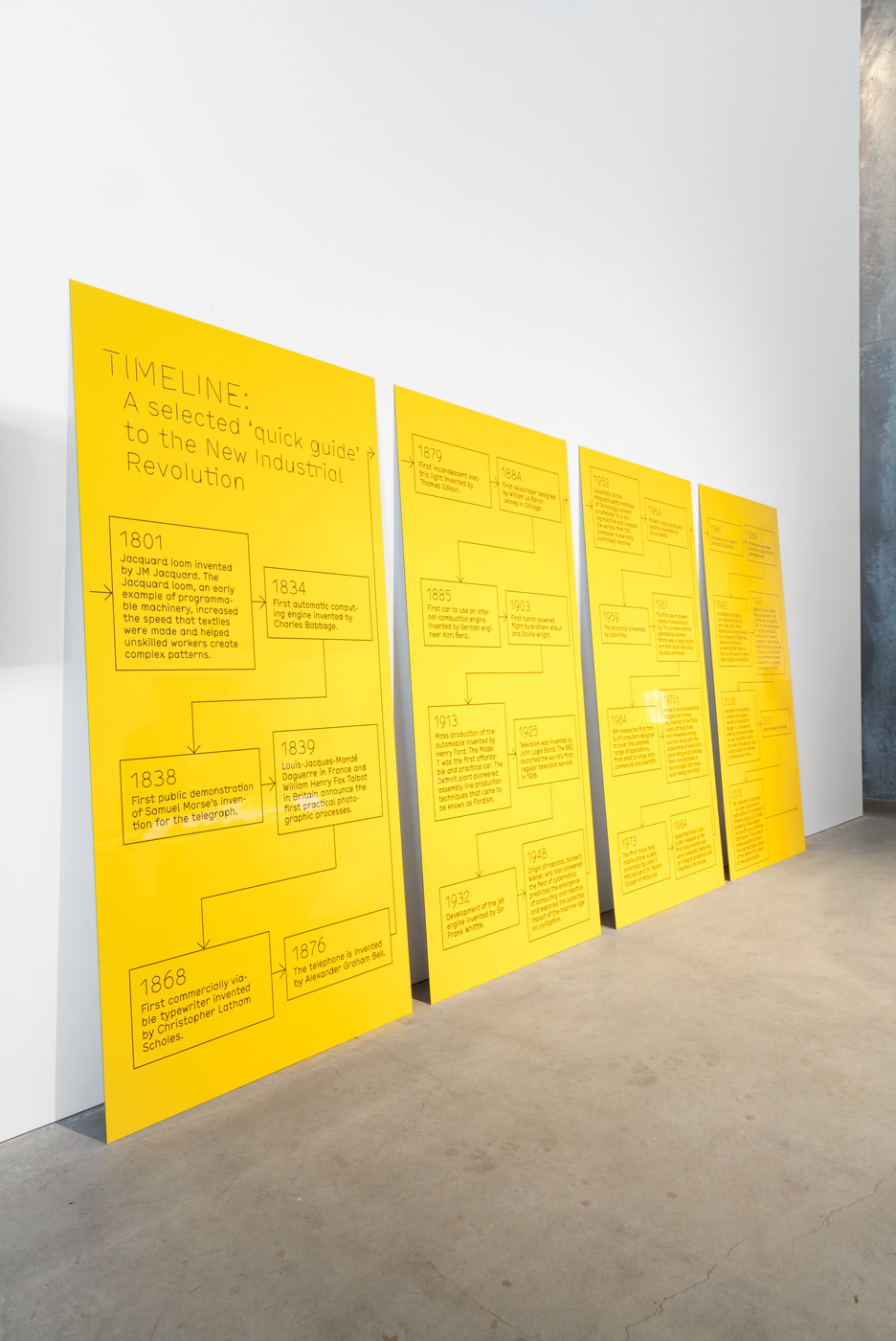
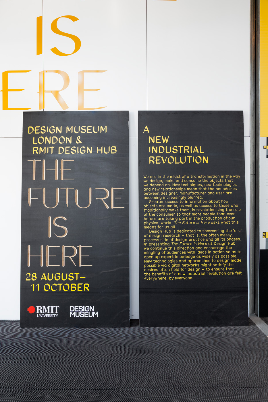
- Form ply panels with 3-axis routed lettering and large-scale UV flatbed printing
- Yellow Alucabond panels with large-scale UV flatbed printing
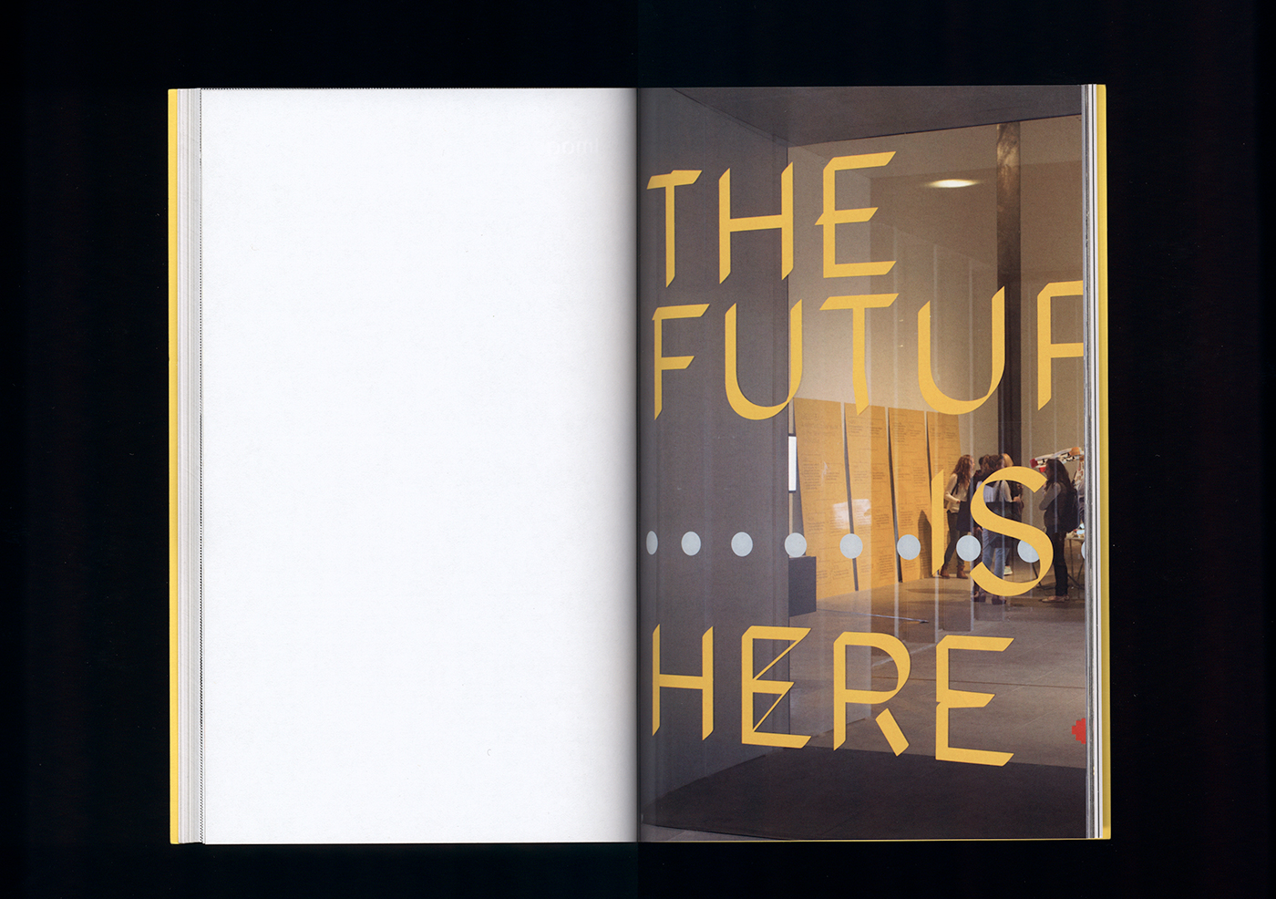
- Reflective vinyl cut lettering for windows
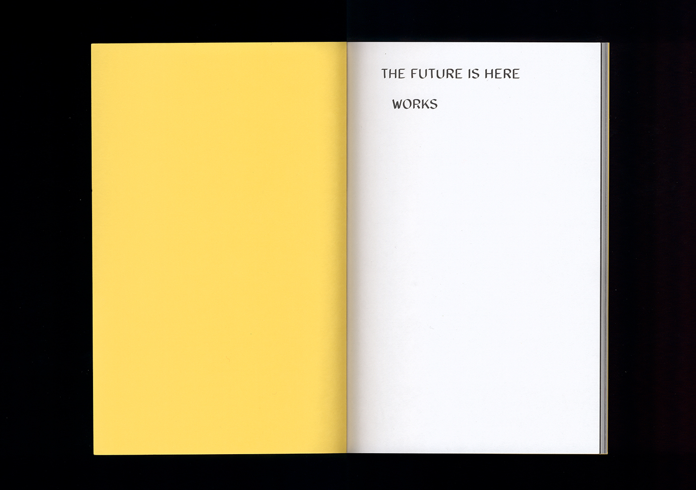
- 120pp A5 catalogue (2 versions with different colour plate sections and unique covers over a 4000 print run)
- Type: The Future Is Here Regular made by Dan Milne
- Photographs: Mostly Christo Crocker, details by me.
- Curators: Fleur Watson and Kate Rhodes (Design Hub, Melbourne), Alex Newson (Design Museum, London)